It’s important to add alt text to images in order to make them accessible to users of screen readers.
I compose this blog using the excellent blogdown package, which enables me to easily include code-generated plots. Yesterday, I decided to finally figure out how to add alt text to these plots. I’m sharing what I learned in order to help others in the R community make their visualizations more accessible and as a reminder to myself.
For still images, alt text can be added using markdown syntax (or the “insert image” menu option, under “Addins”): 
Another way to add alt text to images is to use Hugo shortcodes. In markdown, these codes can be used as is. So {{% figure src="image.jpg" alt="Informative text" %}} would render a figure with accompanying alt text in a markdown document.
In rmarkdown documents, Hugo shortcodes won’t render directly, so it is necessary to use the shortcode function from the blogdown package:
blogdown::shortcode("figure", src = "image.jpg", alt = "Informative text")
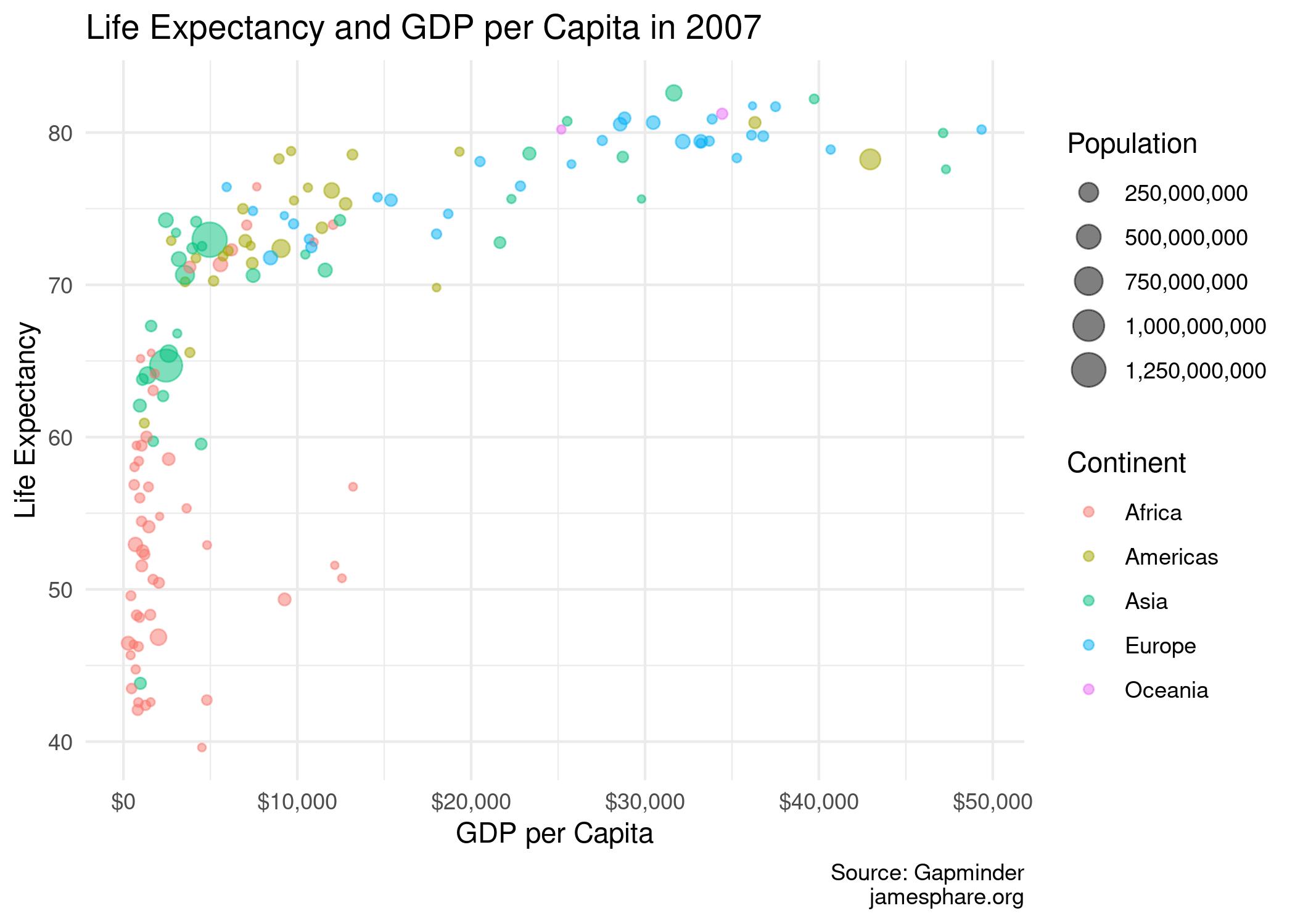
So that works for static images, but how about code-generated plots? In these cases, we can save the output then use the shortcode to display it with an appropriate alt text.
But what about code-generated plots? In this case, we can generate and save a static image then add the alt text using the above method. It’s a small extra step but worth it to improve accesibility.
library(tidyverse)
## ── Attaching packages ─────────────────────────────────────── tidyverse 1.3.1 ──
## ✓ ggplot2 3.3.3     ✓ purrr   0.3.4
## ✓ tibble  3.1.1     ✓ dplyr   1.0.6
## ✓ tidyr   1.1.3     ✓ stringr 1.4.0
## ✓ readr   1.4.0     ✓ forcats 0.5.1
## ── Conflicts ────────────────────────────────────────── tidyverse_conflicts() ──
## x dplyr::filter() masks stats::filter()
## x dplyr::lag()    masks stats::lag()
library(gapminder)

gapminder <- gapminder

gapminder <- gapminder %>%
        filter(year == 2007)

gapminder_image <- ggplot(gapminder) +
        geom_point(aes(gdpPercap, lifeExp, size = pop, color = continent), alpha = 0.5) +
        theme_minimal() +
        labs(title = "Life Expectancy and GDP per Capita in 2007",
             caption = "Source: Gapminder\njamesphare.org",
             x = "GDP per Capita",
             y = "Life Expectancy",
             color = "Continent",
             size = "Population") +
        scale_size(labels = scales::comma) +
        scale_x_continuous(labels = scales::dollar)

ggsave("images/gapminder_image.jpg", plot = gapminder_image)
## Saving 7 x 5 in image

For tips on writing good alt text, check out this article from the DataViz Society/Nightingale (via TidyTuesday).
My source code is available on GitHub. And if there’s a better or easier way to do this, please let me know!