This week’s Tidy Tuesday speaks to the importance of visualization in data exploration. Alberto Cairo created this simulated data set in order to demonstrate how misleading summary statistics can be and to show how useful visualization is in uncovering patterns in data. In this spirit, let’s start exploring this data set to see what we find.
## Rows: 1,846
## Columns: 3
## $ dataset <chr> "dino", "dino", "dino", "dino", "dino", "dino", "dino", "dino"…
## $ x       <dbl> 55.3846, 51.5385, 46.1538, 42.8205, 40.7692, 38.7179, 35.6410,…
## $ y       <dbl> 97.1795, 96.0256, 94.4872, 91.4103, 88.3333, 84.8718, 79.8718,…
##    dataset                x               y
##  Length:1846        Min.   :15.56   Min.   : 0.01512
##  Class :character   1st Qu.:41.07   1st Qu.:22.56107
##  Mode  :character   Median :52.59   Median :47.59445
##                     Mean   :54.27   Mean   :47.83510
##                     3rd Qu.:67.28   3rd Qu.:71.81078
##                     Max.   :98.29   Max.   :99.69468
##  [1] "dino"       "away"       "h_lines"    "v_lines"    "x_shape"
##  [6] "star"       "high_lines" "dots"       "circle"     "bullseye"
## [11] "slant_up"   "slant_down" "wide_lines"
We have 1,846 sets of x and y coordinates divided up into thirteen descriptive data sets.
## # A tibble: 13 x 6
##    dataset    Mean_X Mean_Y  SD_X  SD_Y    Corr
##    <chr>       <dbl>  <dbl> <dbl> <dbl>   <dbl>
##  1 away         54.3   47.8  16.8  26.9 -0.0641
##  2 bullseye     54.3   47.8  16.8  26.9 -0.0686
##  3 circle       54.3   47.8  16.8  26.9 -0.0683
##  4 dino         54.3   47.8  16.8  26.9 -0.0645
##  5 dots         54.3   47.8  16.8  26.9 -0.0603
##  6 h_lines      54.3   47.8  16.8  26.9 -0.0617
##  7 high_lines   54.3   47.8  16.8  26.9 -0.0685
##  8 slant_down   54.3   47.8  16.8  26.9 -0.0690
##  9 slant_up     54.3   47.8  16.8  26.9 -0.0686
## 10 star         54.3   47.8  16.8  26.9 -0.0630
## 11 v_lines      54.3   47.8  16.8  26.9 -0.0694
## 12 wide_lines   54.3   47.8  16.8  26.9 -0.0666
## 13 x_shape      54.3   47.8  16.8  26.9 -0.0656
These data sets have a lot in common. Specifically the x and y means, x and y standard deviations, and Pearson’s correlation coefficients are nearly identical.
Let’s try fitting each data set to a linear model.
## # A tibble: 26 x 6
##    dataset term        estimate std.error statistic  p.value
##    <chr>   <chr>          <dbl>     <dbl>     <dbl>    <dbl>
##  1 dino    (Intercept)  53.5        7.69      6.95  1.29e-10
##  2 dino    x            -0.104      0.136    -0.764 4.46e- 1
##  3 away    (Intercept)  53.4        7.69      6.94  1.31e-10
##  4 away    x            -0.103      0.135    -0.760 4.48e- 1
##  5 h_lines (Intercept)  53.2        7.70      6.91  1.53e-10
##  6 h_lines x            -0.0992     0.136    -0.732 4.66e- 1
##  7 v_lines (Intercept)  53.9        7.69      7.01  9.38e-11
##  8 v_lines x            -0.112      0.135    -0.824 4.12e- 1
##  9 x_shape (Intercept)  53.6        7.69      6.97  1.17e-10
## 10 x_shape x            -0.105      0.135    -0.778 4.38e- 1
## # … with 16 more rows
The intercept, slope and standard errors are all pretty much identical. Let’s plot these models and take a look.
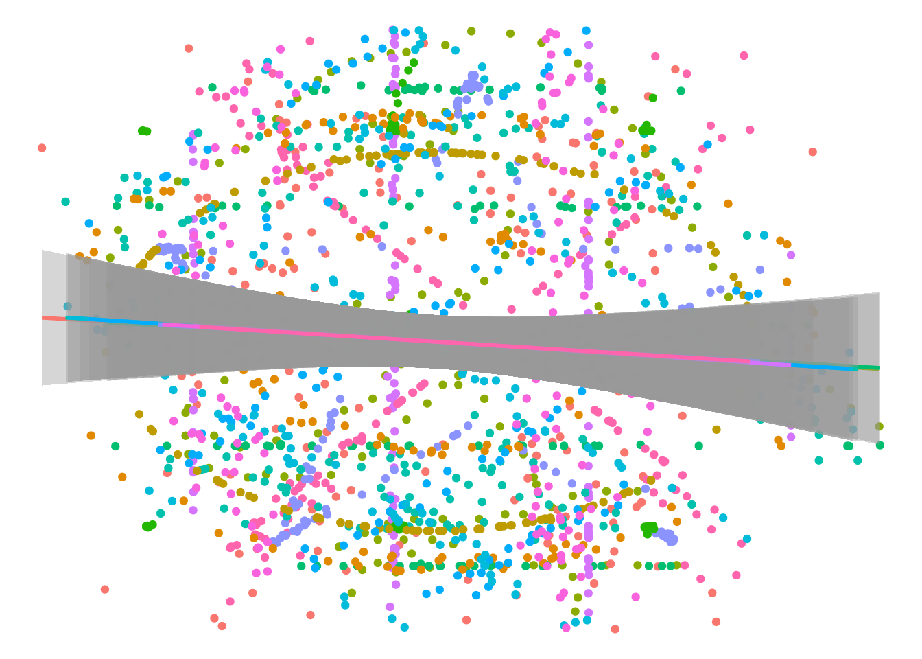
The models match up nicely, but there’s a lot of noise and there seem to be some strong unexplained patterns in the underlying data. Let’s look at each data set individually.
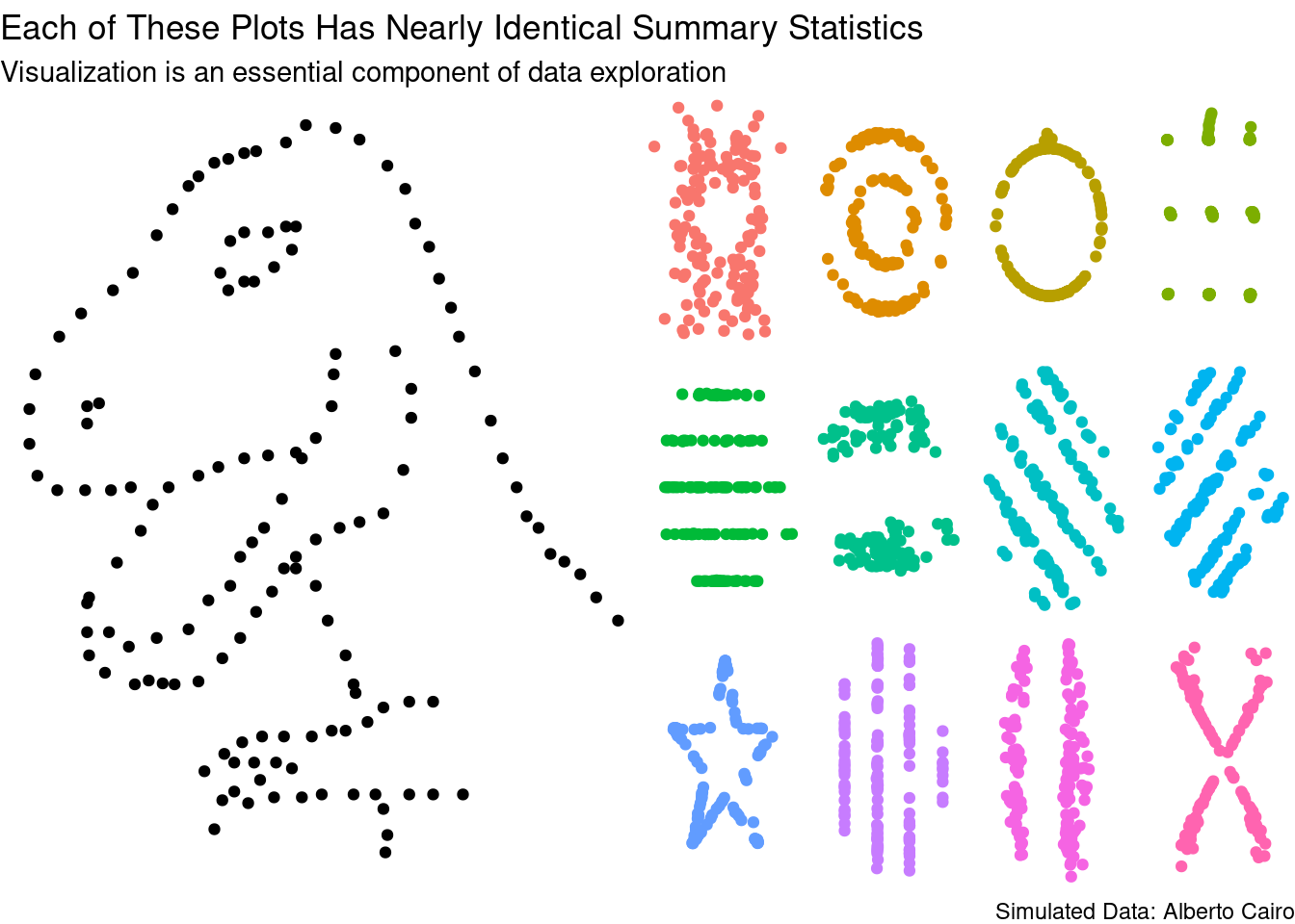
These plots are much more different than the summary statisitcs would suggest!
That’s all for this week. Check out the code on GitHub.