Early on in the pandemic, I became frustrated by the lack of quality visualizations of local COVID-19 data, particularly concerning Metro Atlanta, where I live, so I set out to create a set of visualizations of these data. Since then, the situation has improved greatly, but these plots still provide some details and comparisons that I have not seen elsewhere.
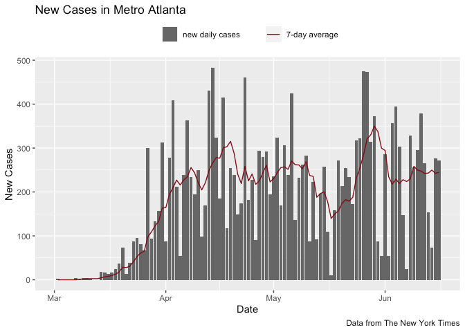
The first item I set out to create is an Rmarkdown document focused on Metro Atlanta that visualizes the distribution of cases and deaths as they change over time. The charts in this document track new cases and deaths in the core Metro Atlanta counties, both in absolute and relative terms. Subsequent charts provide context by tracking new cases and deaths in Metro Atlanta, Georgia, and the United States.
The second product of this project is a Shiny web app, which visualizes new case and death data for the entire United States, with a focus on county-level data in the context of state and national data. This reactive app allows the user to look at data from any state and county in the United States, subject to the geographic limitations of the original data set.
The source code for this project is available on GitHub.
All data come from the New York Times’ ongoing repository of COVID-19 cases and deaths in the United States.