So this post may be something of a cautionary tale about getting ahead of yourself when it comes to analyzing data. The DeKalb County Board of Health releases numbers on the spread of COVID-19 in the county, most recently on July 6. Included with these data is a breakdown of the county’s 7,043 cases by ZIP Code. It is immediately apparent that while this disease has affected the entire county, its effects have not been felt evenly.
It is difficult not to speculate on the causes of this variation. Have the policies of local governments prevented or exacerbated outbreaks? Has the politicization of mask wearing and social distancing led to increased spread in more conservative areas? Have certain communities had more access to testing resources—or chosen to get tested more often—than others? Are higher density areas more likely to see outbreaks than more suburban areas of the county?
I had a hypothesis that while any or all of these factors may contribute to the spread of COVID-19, a major contributor to COVID-19 variability from ZIP Code to ZIP Code in DeKalb is income inequality. So I extracted the raw data from the county’s Board of Health and combined it with census data to calculate cases per thousand residents. I immediately noticed what seemed like a strong correlation between median household income and COVID-19 rates. The poorest ZIP Code in the county when measured by median household income showed 13.5 positive cases per thousand residents while the richest showed only 1.7 cases per thousand.
When I analyzed the numbers more formally, I found that while the differences in COVID-19 rates seemed most pronounced at the extremes, there seemed to be a clear correlation between rates of infection and median household income throughout the county. For every extra $10,000 in median household income, the number of cases per thousand seemed to drop by 1.15. Median household income seemed to account for around a quarter of COVID-19’s geographical variability in DeKalb County.
So I got ready to write a fiery article arguing that low-wage service workers’ exposure to unsafe working conditions was leading to higher rates of COVID-19 in their communities. (I still believe this to be true, but it’s not evident at the level of ZIP Code in DeKalb)
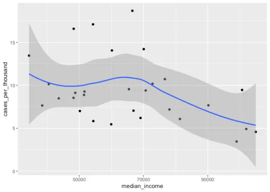
But as I was writing up my results, I realized I had made a fatal mistake. ZIP Codes do not follow county boundaries! Fortunately, the U.S. Census Bureau provides data on what portion of a ZCTA (a Census category roughly analogous to ZIP Codes) falls within a particular county. I used this information to re-run my analysis and found out that while a correlation exists, it’s not as substantial as I had thought. I made a plot of this data and it seemed at first that while there was not necessarily a linear relationship between median household income and COVID-19 rates, it did seem like the wealthiest ZIP Codes had the lowest rates.
So I re-categorized each ZIP Code categorically, sorting each area into the wealthiest neighborhoods, with median household incomes of at least $80,000, and everyone else. And it turns out that there is a substantial and statistically significant difference between these neighborhoods and less well off ones.
##
## Call:
## lm(formula = cases_per_thousand ~ neighborhood_wealth, data = dekalb)
##
## Residuals:
##     Min      1Q  Median      3Q     Max
## -4.7480 -2.5631 -0.9299  1.6408  8.4739
##
## Coefficients:
##                         Estimate Std. Error t value Pr(>|t|)
## (Intercept)              10.2078     0.7294  13.994 6.82e-14 ***
## neighborhood_wealthrich  -4.1825     1.6037  -2.608   0.0147 *
## ---
## Signif. codes:  0 '***' 0.001 '**' 0.01 '*' 0.05 '.' 0.1 ' ' 1
##
## Residual standard error: 3.498 on 27 degrees of freedom
## Multiple R-squared:  0.2012, Adjusted R-squared:  0.1716
## F-statistic: 6.802 on 1 and 27 DF,  p-value: 0.01466
However, as I looked more closely at the visualization, I noticed that while none of the wealthiest ZIP Codes are among the most affected, most of the other ZIP Codes have similar rates to the wealthiest ones. Just five or six ZIP Codes stand out as having elevated rates.
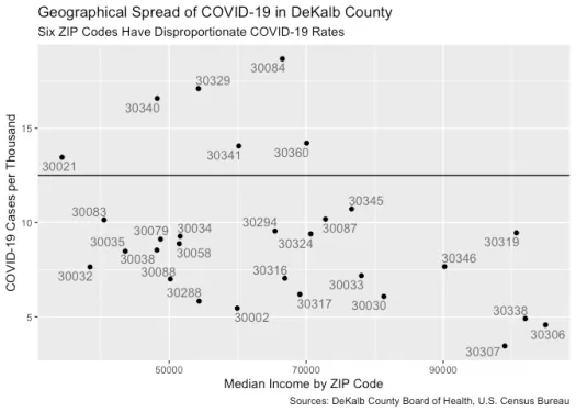
I put some thought into thinking about what sets these ZIP Codes apart from the rest of the county, and I decided to make a map (while this map does not exactly trace the boundaries of DeKalb, the data represented only includes the portions of these ZIP Codes that are in DeKalb) .
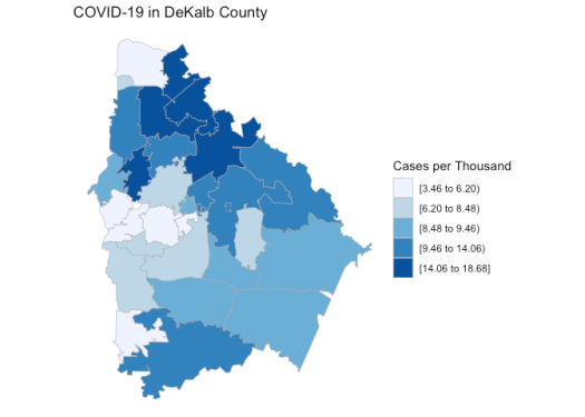
From this perspective, it looks like the highest COVID-19 rates are clustered in the Northeast part of the county, but I don’t yet know what if anything this tells us about the spread of COVID-19.
Even though this particular exploration didn’t uncover clear evidence that local income inequality is contributing to an uneven spread of coronavirus, it doesn’t mean that this isn’t the case.
Certainly, other forms of inequality also contribute to a greater risk of contracting COVID-19. The New York Times has reported that Black and Latino people in the United States are more than three times likely to contract the virus than white people and more than twice as likely to die from it.
This pandemic has brought so many facets of U.S. society into sharp relief. In DeKalb, in Georgia, in the United States, and throughout the world, we’re all feeling the effects of this crisis, but we’re not feeling them equally.
For more details on my methodology or to check out my code, visit my GitHub page.