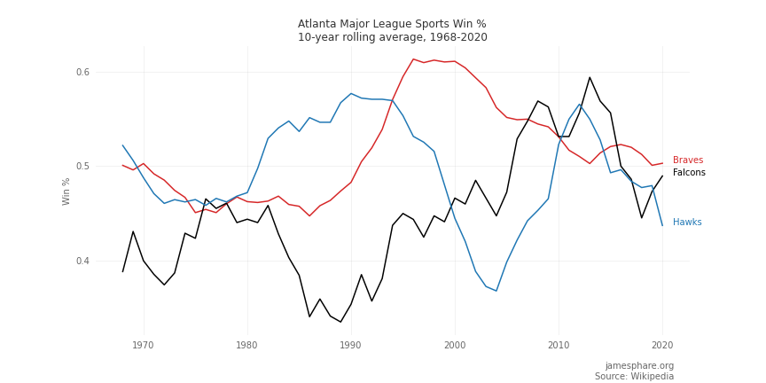
As part of my ongoing effort to learn Python for data analysis, I created this chart summarizing the relative performance of Atlanta’s major league sports teams since the Hawks moved to Atlanta in 1968. Atlanta has not consistently had an NHL team during this time period, and Atlanta’s MLS team is a much more recent addition. In order to facilitate comparisons across sports, ties have been disregarded. The data is presented here as a 10-year rolling average in order to smooth out spikes from one season to the next.
In the plot, we can clearly see the Braves' dominant performances during the 1990s and early 2000s. We can also see the Falcon’s consistently poor performance prior to peaking around 2010. The Hawks had some great years during the 80s and 90s only to crash and then rebuild for more winning seasons around 2010.
Source code available here.